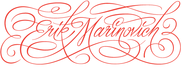
Erik Marinovich is a San Francisco based lettering artist and designer, and is a co-founder of Friends of Type. Since 2009 he has drawn letters, logos and type for nice folks like: Nike, Target, Google, Hilton, Facebook, Sonos, Sharpie, The Criterion Collection, Air Canada, Gap, Ford Motor Company. In 2012 he co-founded Title Case, a creative work space that conducts workshops and lectures. Between client work, teaching and side-projects, you’ll find him on the road promoting Keep Fresh Stay Rad and Let’s Go Letter Hunting, two new releases from Friends of Type published by Princeton Architectural Press.
Erik is currently accepting freelance lettering and design work and is available for conference and university speaking engagements. This website was lovingly designed and developed by Jessica Hische in Wordpress from Elliot Jay Stocks’s Starkers Theme. The logotype is custom lettering by Erik. The typefaces used are Chaparral Pro by Carol Twombly, Herb by Just Another Type Foundry, and Learning Curve by BV Fonts. Typefaces hosted by Typekit.